How to Choose Colors for Wall Art
Have you already decided on a color scheme, wall paint color, or maybe even picked out your furniture and bedding for your room? It’s easy to coordinate your Amborela wall art with the rest of your room decor.
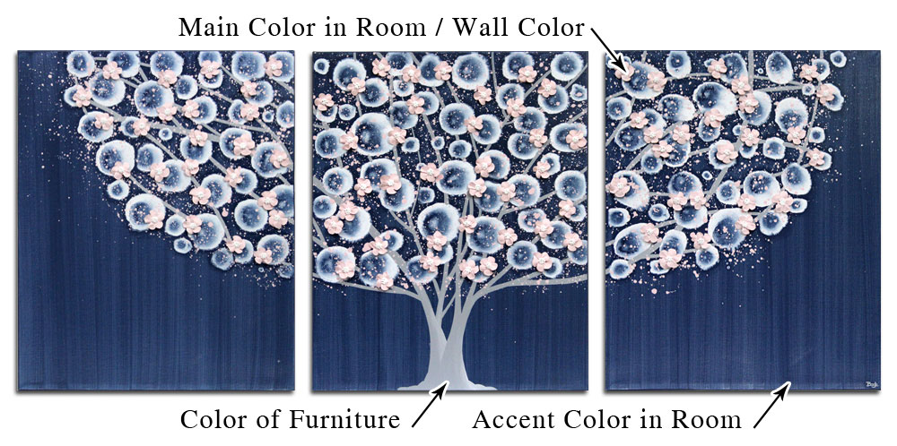
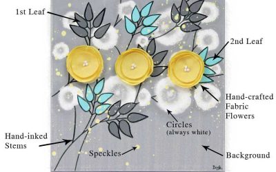
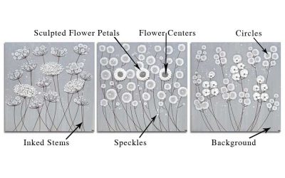
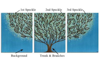
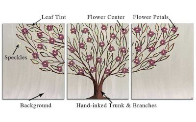
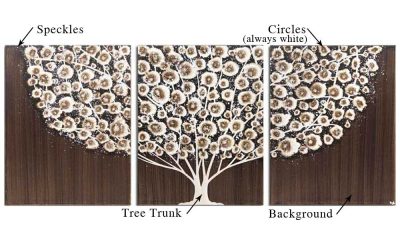
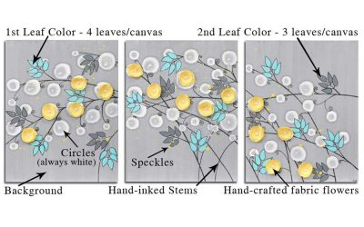
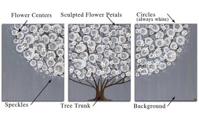
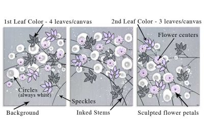
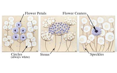
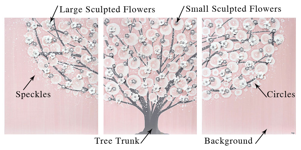
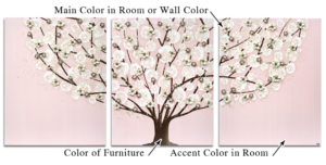
- Tree trunk: color of furniture
- Background: accent color in room
- Sculpted flowers: main color in room or wall color
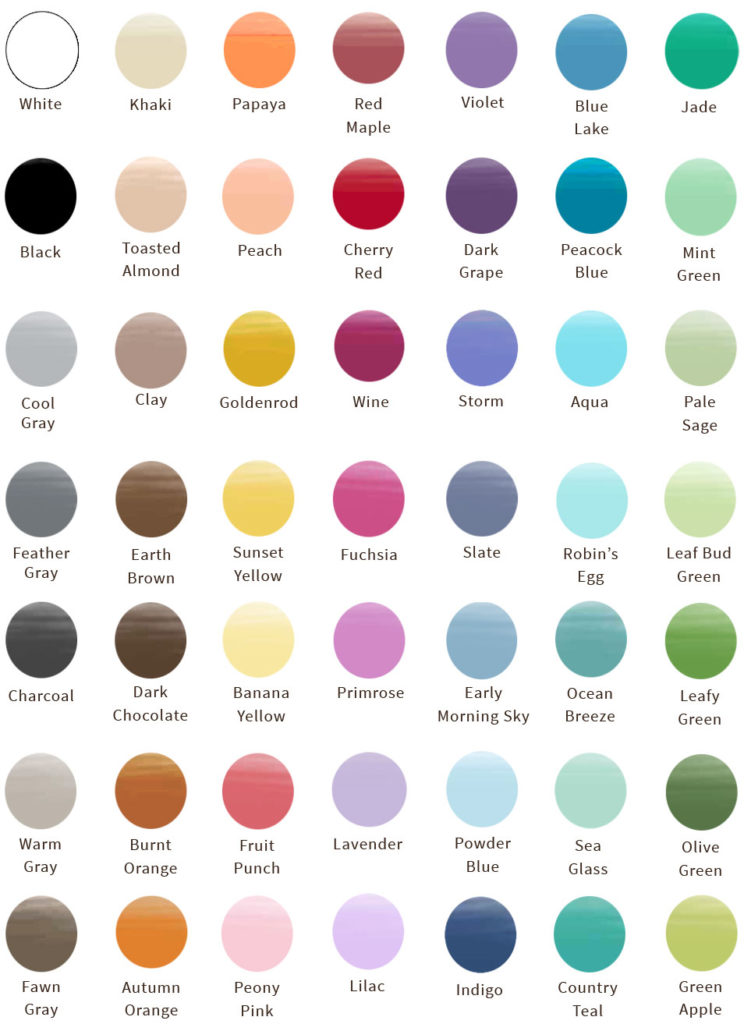
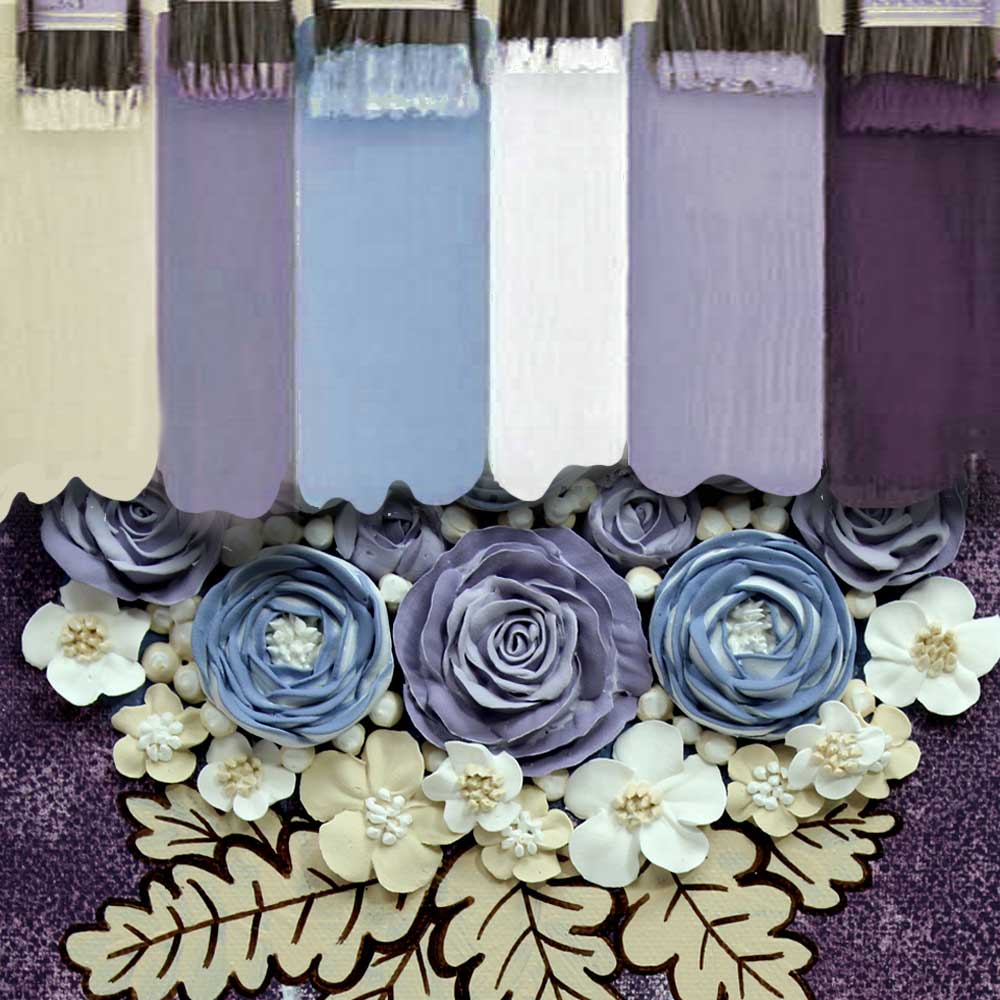
Start by choosing the colors that coordinate best with your décor from the Amborela color chart.
Not sure if a color will match? Order a free color swatch. Then arrange your color layout based on the above placement guide. Ask for a mock-up based on this color guide to see what your painting would look like.
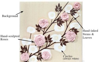
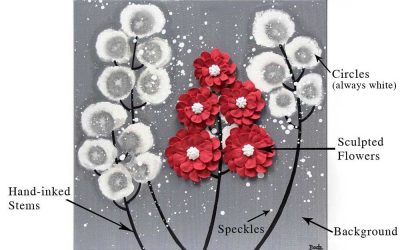
Background Color
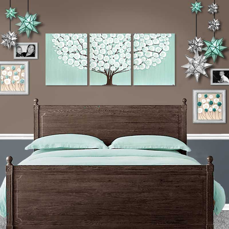
- Choose the accent color in your room as the main color for your painting. In Amborela paintings, the background is the main color, because it takes up the most visual space. As a general rule, the main color in your artwork should be the accent color in your room. Even large art, while it makes a great focal point, is still only an accent; a small fraction of your entire room.
- Create contrast between your painting and the surrounding wall color. Choose a background color that is significantly different in hue and tone than your wall paint. If you choose a background color that is similar to your wall color, the painting will blend into the wall too much.
- Once you have chosen a different hue than your wall paint, considering adjusting the tone to make your artwork pop. A light toned painting stands out against a mid to dark toned wall. And a dark toned painting stands out against a light to mid toned wall.
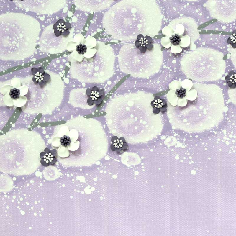
- Fabric and sculpted flowers on Amborela paintings look great in the main color of the room.
- Do you have a large area of color near your painting that isn’t technically your main room color? The color of a nearby wall, rug, or bedding will also be a great choice for your 3d flower color.
- You have more color options with sculpted flowers than fabric flowers. Choose from the paint color chart for sculpted flowers. See options on fabric flower chart
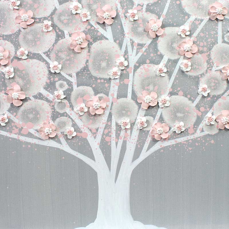
- Choose a neutral hue for your tree trunks and flower stems. Here’s an opportunity to coordinate your art with your furniture finish, creating a truly custom art look. Dark walnut, white, gray, and French gray wood finishes have coordinating colors on the Amborela color chart.
- Create contrast between the trunk or stems and the surrounding background. Choose a dark color for your trunk or stems when you choose a light background color. And choose a light color for your trunk or stems when you choose a dark background color.
- Metallic gold tree trunks are an option if you want to bring out the gold furniture or accents in your room.
Choose from Amborela’s most popular designs to customize in a different color scheme.
If you are just starting to decorate your nursery, you can plan to coordinate with a focal art piece. Learn more about using art as an inspiration for your nursery design.
Shop Art by Color
Finding a piece of art you absolutely love is a great way to pick a color palette and mood for a room when your not sure where to start your decorating project. Your preference for an artwork can give you an idea of your style. For example, you might be drawn to bold color or neutrals, geometric or organic shapes, maximal or minimal design. Below are some ways to start exploring color pairing ideas for home décor.
Get inspired by color scheme ideas for home, nursery, office, and wedding décor.
Browse art and coordinating soft furnishings in curated collections designed by Amborela for easy mix and match decorating.